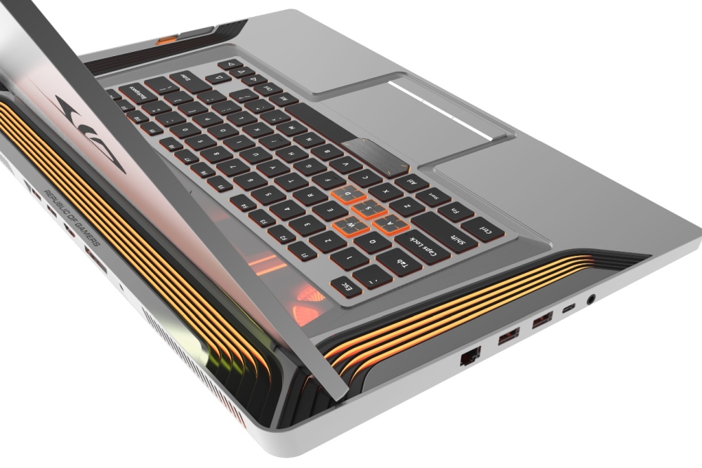
So, what exactly are we looking at? To start, we’re looking at a primarily silver laptop, as opposed to the dark overtones ASUS has seemingly adopted with its current ROG laptop lineup. But flipping the lid up is when you’ll really see the difference between the Face Off concept and the existing ROG design language.
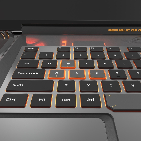
For one, you’ll see what ASUS describe as gills around the spine of the laptop, as well as the sides of the keyboard. They’re definitely effective at drawing eyeballs to them, but they also serve as ventilation for notebooks using this design. The company also says that they have LEDs below, with lighting effects that you can customise. And for those who love lighting effects on their laptops, Face Off Concept is clearly peppered with LEDs. The design also details a translucent panel just above the keyboard. That allows the lights from the internal components to shine through.
Finally, we have the keys on the keyboard itself. The WASD keys, as well as the left side of the space bar, are depicted as having a thin sheet of metal just barely covering the top. This allows them to be distinct from the other keys, and for users to feel the difference between them and other keys, naturally. Of course, ASUS is quick to point out that the ROG Face Off Concept is just that – a concept. That said, some of the design language has trickled down to other gaming laptops in the ROG line, such as the ROG Strix G. As for other ROG laptops, we’ll just have to wait and see which of the newer ones get the Face Off treatment.

