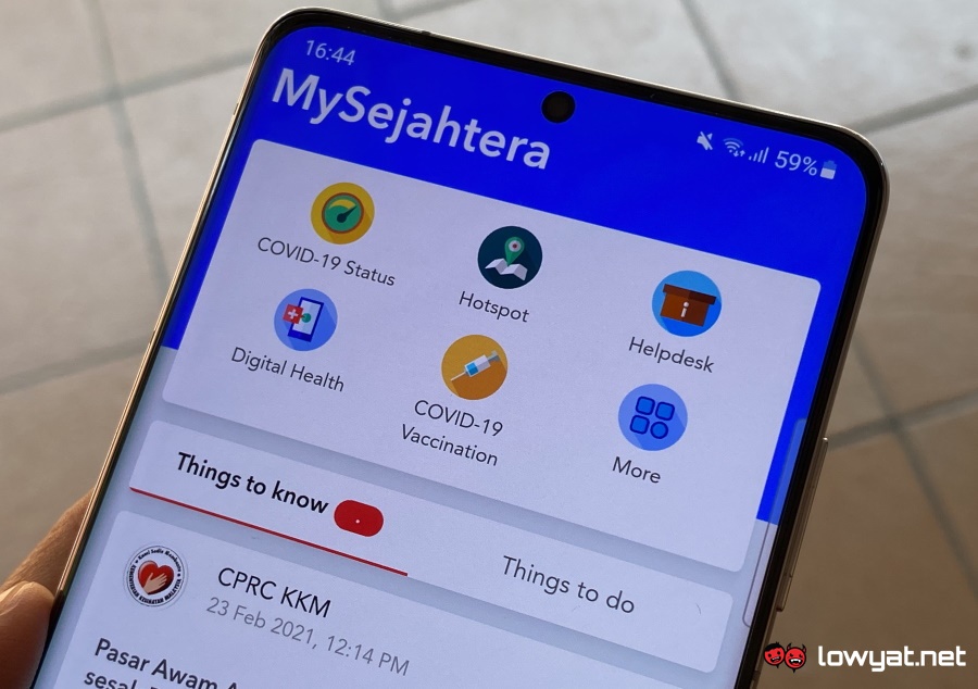
The app is also the main registration method for the National COVID-19 Immunisation Programme (PICK) while carrying the digital vaccination record for Malaysians. Despite that, MySejahtera’s user interface and experience are still not much different from the time it was first released in April 2020. Not surprisingly, many felt that the app may need a fresh set of new user interface and experience.
One of them is Shahid Rogers, a developer at a local bank who has recently shared his take on the app through his Twitter account, @rojakdude. In a conversation with Lowyat.NET late last month, he said that the genesis of the design was inspired by the discussions with some of his friends regarding how their parents were struggling to use MySejahtera. Not only that, he also felt that by having an improved design, MySejahtera could help address the never-ending confusion and miscommunications surrounding the ever-changing SOPs. As many have been quite critical of the app, the mock-up design is Shahid’s way to provide some constructive criticism towards MySejahtera.
— shahid rogers (@rojakdude) May 28, 2021 While he thinks that the current design is not bad, Shahid still thinks that MySejahtera should be a lot more user friendly and informative. Additionally, he also pointed out the app has plenty of duplicate information as well as features that are difficult to find, and a general lack of clarity. The original mock-up design which focused on vaccine registration and appointment allocations took Shahid around one hour to design. He has since improved the design further and has also come out with two more screens in the form of Group Check-in and Vaccine Education.
This time around, I made some adjustments to the dashboard to spark a conversation about “zones” and a feature to apply/show your travel pass. i’ve also elaborated my ideas on group-checkins + vaccine education. sekian. #mysejahtera #design pic.twitter.com/2CgdbpCpFA — shahid rogers (@rojakdude) June 1, 2021 Shahid said that there was only one thing on his mind when he came out with the original mock-up design which is to create something that works for most people and not just tech-savvy users. He further added that many apps out there are not built with seniors in mind, let alone the impaired; even though the world has begun to revolve around mobile apps and online services. Hence, he hopes that everyone could elevate more towards inclusive design especially when it comes to products that we need to use on a daily basis. While we certainly agree with him regarding the inclusive design, we also wished that the team behind MySejahtera could take a look at the performance of its backend system which seems to be experiencing some performance issues as of late.
